

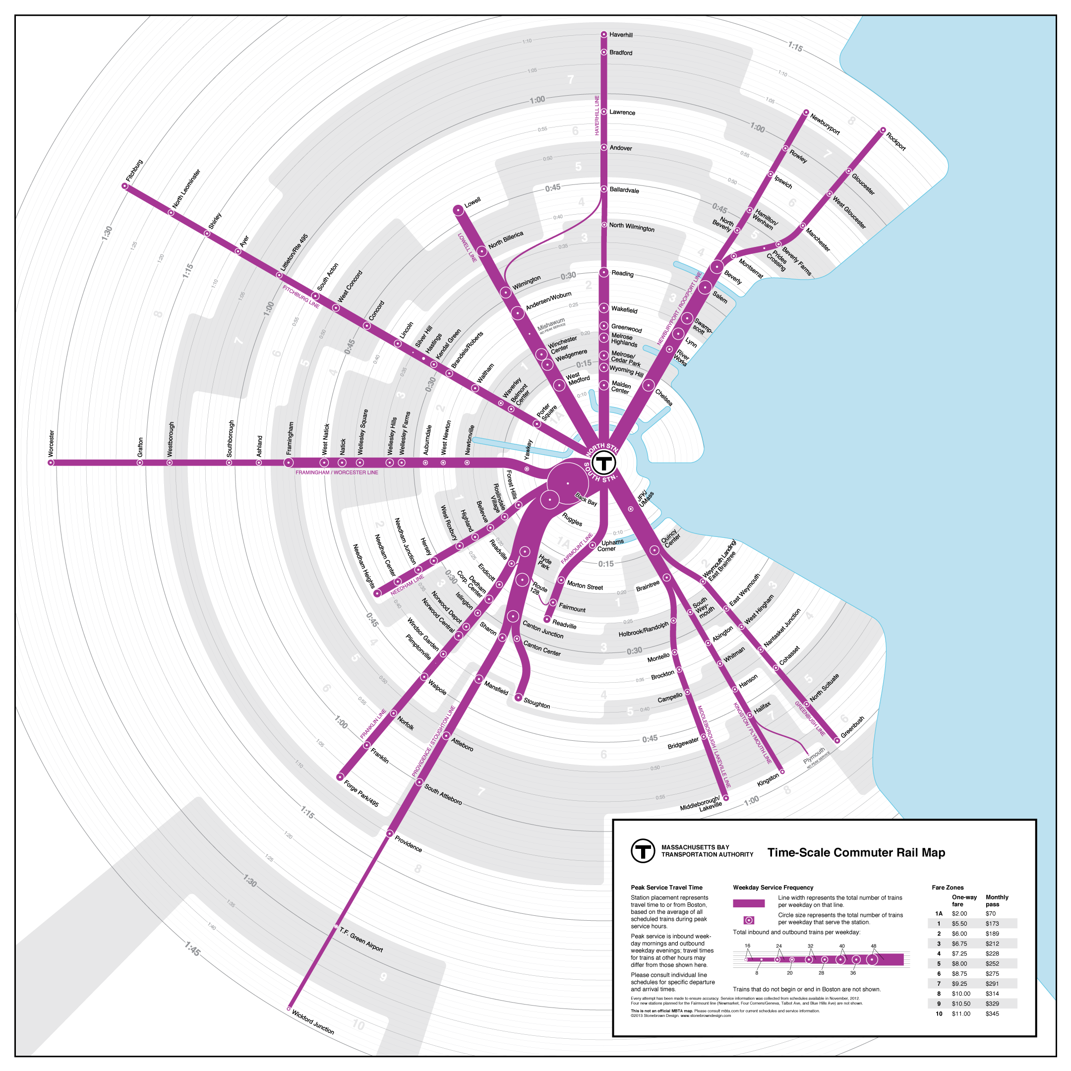
My next map project. Via Transit Maps. This map, called a time-scale map, shows the Massachusetts Bay Transit Authority (MBTA) commuter rail network in Boston. This graphically simple map shows distance according to time and the lines are weighted according to frequency. A fare table is provided in the legend, thus the map answers some of the most common transit questions: How long is the journey? How much does it cost? How frequent is the service. Brilliant.
One of the aspects of the real gig that I enjoy most is having the responsibility of maintaining the agency’s geographic information system (GIS) data. I also am responsible for many of the map products produced. I’m always looking for a better way to display data and this is great. I hope to make something like this soon.
